📍 Serving: New Delhi ,Noida,Delhi-NCR
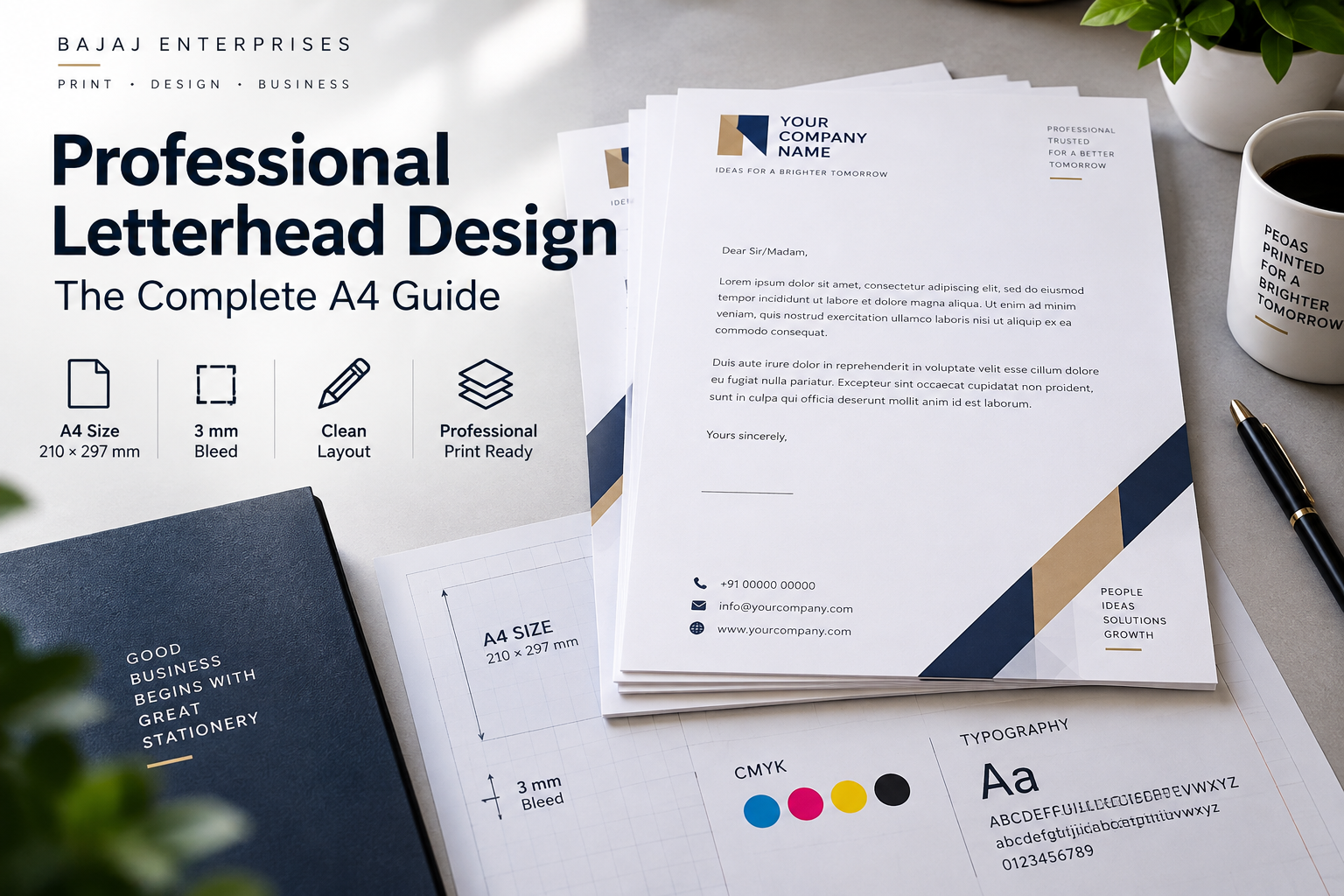
Picture this: a business owner spends two weeks preparing a proposal, refining every argument, polishing every number. Then it lands in the client's inbox as a Word document, a logo dropped awkwardly into the header, plain white page beneath it. Professional letterhead design is precisely what separates that first impression from one that signals credibility, and many recipients form that impression the moment the file opens, well before the first sentence is read. That impression is not "thorough proposal." It is "this business doesn't quite have its act together."
Your letterhead is the physical face of your brand. It appears on proposals, invoices, legal correspondence, and partner communications. A poorly designed one signals carelessness; a well-crafted one builds instant credibility before a single word of body text does any work. The difference between the two is rarely expensive or complicated; it is mostly about knowing the right decisions to make.
This guide covers exactly that: the core elements a letterhead must include, the correct A4 specifications for print, typography and colour choices that hold up on paper, template options worth considering, and how to get the final result printed to a standard that matches the quality of your design. At Bajaj Enterprises in Kalkaji, we work with a wide range of businesses on professional letterhead design every month, and the same design mistakes keep showing up. This guide fixes all of them.
What your letterhead communicates before anyone reads a word
A branded letterhead tells the recipient that the business sending it is organised, established, and attentive to detail. In B2B contexts particularly, this matters enormously. A proposal arriving on a crisp, well-designed corporate stationery header reads as the work of a serious organisation. The same content on a plain page with a low-resolution logo reads as provisional, as though the company is still figuring itself out.
Compare an invoice on a plain document to one on a structured, typographically sound business letterhead design. The numbers are identical. The payment terms are identical. But the psychological difference is significant: the second version looks like the sender has been in business long enough to get the details right. That perception can plausibly influence how seriously clients and partners engage, and how confidently new contacts follow through.
Printed letterheads carry additional weight that digital documents do not. A physical sheet on premium paper is tactile and memorable in a way that a PDF attachment simply is not. That advantage is only realised, though, if the design quality and the print quality are matched. An excellent design reproduced poorly on thin, inkjet-printed stock undermines the entire exercise. The design and the paper it lives on are a single decision, not two separate ones.
Typography and colour for professional letterhead design: where most layouts quietly fail
Use no more than two typefaces on a letterhead: one for the company name or header, one for the contact details and body reference text. More than two creates visual noise that reads as unpolished rather than creative. For corporate and legal contexts, serif fonts like Baskerville, Garamond, or Georgia carry authority. Clean sans-serifs like Montserrat, Helvetica, or Lato work well for modern brands. A strong pairing, Playfair Display with Montserrat, or Merriweather with Work Sans, gives the design personality without clutter.
Keep contact detail text at a minimum of around 8pt as a general guide; anything smaller tends to become difficult to read when printed on standard A4 stock, particularly on uncoated paper where ink spreads slightly into the fibre. Always test the design at actual print size before finalising, because a font that looks clean on a 27-inch monitor can look markedly different at 100% print scale.
Colour is where designs most frequently fail at the print stage. The colour on your monitor is displayed in RGB, but commercial printers work in CMYK. A vivid red or a bright blue on screen can shift noticeably when printed if the file has not been converted correctly.
Always design in CMYKfrom the start, or convert the colour profile carefully before exporting. In Adobe Illustrator or Photoshop, use "Convert to Profile" rather than simply switching the document mode; profile-based conversion preserves colour more predictably. Stick to two or three colours from the established brand palette. Introducing new shades only in the letterhead creates inconsistency across all brand touchpoints, which is the opposite of what a well-produced letterhead is meant to achieve.
A4 layout, margins, and print specs for a printable letterhead
The standard finished size for Indian business correspondence is A4: 210 × 297 mm. Design at this exact size, not "approximately A4." Even a few millimetres of difference causes alignment problems when the file goes to print. Set up the document at these dimensions before placing a single element.
If any design element (a background colour, a coloured band along the top or bottom, a border) reaches the edge of the page, add 3 mm bleed on all sides. Without bleed, the trimming process at the print stage leaves thin white slivers along the edges, and no amount of careful trimming eliminates this entirely.
Keep all critical content, logo, contact text, any graphic elements, at least 3 mm inside the trim line. For the body writing area, maintain 20 to 25 mm margins on all sides; this is both a design standard and a practical usability requirement for the person who will type a letter on the sheet.
Export the final design as a PDF with embedded fonts and CMYK colour. Most commercial printers in India prefer this format, and it is the most consistently reliable way to ensure accurate reproduction. Set all placed images and graphics to 300 DPI. If the design has background elements that reach the edge, include crop marks and bleed in the PDF export settings. Most professional print shops request this as standard, and including it from the start avoids back-and-forth before production begins.
Where to find and customise a letterhead template for your brand
Canva is the most accessible starting point for a letterhead mockup: browser-based, drag-and-drop, and free for most letterhead templates. Export as a high-resolution PDF. The one limitation worth noting is that Canva's free plan may not always produce CMYK-accurate files; if the letterhead is going to a commercial printer, verify the colour mode of the export before submitting the file. Canva's own guidance and your printer's ICC profile requirements are the best reference points here.
Adobe Express offers similar browser-based editing with stronger integration into the Adobe ecosystem, which is useful if the brand already uses Illustrator or InDesign assets.
Microsoft Word is the right choice if the letterhead will be used primarily as a digital document template, so that staff can type correspondence directly onto the branded layout. For professional printing, Word files must be converted to a PDF with embedded fonts before submission to any print shop.
The design style should reflect the industry the business operates in. Corporate and finance clients are best served by minimal layouts with ample white space, structured contact blocks, and navy or charcoal palettes. Legal firms should keep things near-monochrome and conservative, with no decorative elements.
Creative agencies have more latitude for asymmetrical layouts, bold accent colours, and expressive typography. Hospitality and retail businesses can use warmer palettes and elegant typography with subtle texture. Across Indian industries in 2026, the dominant trend in professional letterhead design is restraint: two or three brand elements, generous white space, and a clear visual hierarchy. This also makes the file more consistent and more economical to print at scale.
Self-print or professional print: making the right call
For internal documents or low-frequency correspondence, a laser printer on 90 to 100 GSM copier paper is adequate. The design will be readable and functional, and for purely internal use that is entirely sufficient. The calculation changes when the letterhead is going to clients, legal counterparts, or senior business contacts. In those cases, office printing rarely matches the colour accuracy, sharpness, or paper quality that a production-grade print shop delivers.
The question worth asking honestly is: what will the recipient think when they hold this document? If the answer is "it should feel premium and authoritative," self-printing is the wrong tool for the job. The paper stock matters as much as the design itself. Standard professional letterhead stock is 100 GSM which writes on well, folds cleanly, and conveys a formal, serious character.
For client-facing correspondence that needs to feel more substantial, 120 GSM smooth uncoated paper delivers a noticeable upgrade. Glossy finishes are generally avoided for letterheads because they are difficult to write on, which is an important practical consideration for signed correspondence.
Once the design file is finalised, print-ready CMYK PDF, bleed included, fonts embedded, resolution correct, a production-grade print shop removes all the variables that degrade quality at the office printer stage. At Bajaj Enterprises in Kalkaji, New Delhi, we use production-grade equipment with ICC colour profile support, which means the CMYK values in the design file are reproduced faithfully on paper rather than approximated.
Before production begins, a digital proof confirms that colour and layout are as intended, so there are no unwelcome surprises on delivery. For businesses that rely on letterheads for regular client communication, this consistency across every print run is what protects the brand over time.
Getting the final result right
Strong professional letterhead design starts with the right elements: a logo with proper clear space, a logical contact hierarchy, and a clean layout that leaves room for the actual letter. It gets refined through consistent typography (two fonts, nothing smaller than around 8pt) and accurate CMYK colour that matches the brand palette rather than approximating it. And it is built to the correct A4 print specifications, bleed, margins, resolution, from the first moment of design, not retrofitted for print at the end.
The design and the print quality are equally important. A polished design reproduced on thin, poorly-printed paper loses most of its impact. How it looks and how it is printed are decisions that need to be made together.
Once the file is ready, bring it to a printer who can match the design's quality on paper. For businesses across Delhi NCR, Bajaj Enterprises offers a proof before production begins, a choice of premium uncoated paper stocks, and colour-accurate output so the letterhead looks exactly as designed, every time.
Get in touch with our team in Kalkaji to discuss your stationery requirements and receive a print-ready sample before committing to a full run. If you would like expert guidance on professional letterhead design, from layout through to print-ready files, our team is ready to help.for professional letterhead printing service in Delhi get in touch with Bajaj Enterprises Print shop.