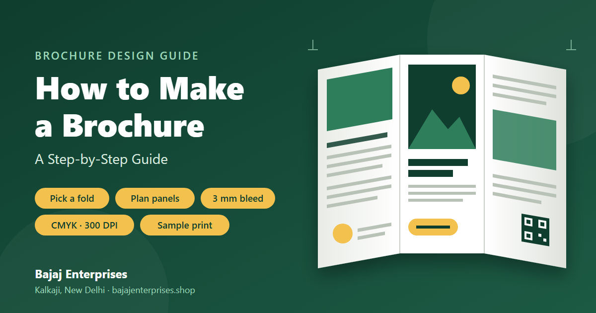
How to Make a Brochure: A Step-by-Step Guide
If you are wondering how to make a brochure that actually works, one that prints cleanly, reads clearly, and earns a response, the process begins well before you open a design tool. There is a specific kind of frustration that comes with staring at a blank page, knowing you need to create a brochure but unsure whether to start with the words or the layout. Many people open a design tool, pick a template that looks attractive, and start filling in text, only to realise halfway through that the content does not fit, the panels are in the wrong order, or the file is not suitable for printing. At Bajaj Enterprises in Kalkaji, we regularly receive brochure files that require corrections, issues that a clearer starting process would have prevented entirely.
This brochure design guide walks you through the process in the right order, from defining your objective to exporting a file your printer can actually use. It also adds a short planning step that can save hours of redesign. Follow these six steps and you will avoid the most common mistakes before they cost you time or money.
1. Define your brochure's purpose before you design anything
What job does your brochure need to do?
Before you choose a colour or a font, nail down the single most important outcome for this piece. A brochure promoting a service, introducing a company, or supporting a trade show stand each requires a different structure and tone. If you cannot describe in one sentence what you want the reader to do after reading it, the design will be unfocused. Taking a few minutes to answer this question clearly can save hours of redesign later.
Who will read it, and how will they receive it?
The distribution context shapes every layout decision. A brochure handed to someone at an exhibition needs a cover that earns attention within seconds; one left in a waiting room can rely on curiosity to draw readers in. Think about your reader's prior knowledge of your brand, what questions they are likely to have, and how much time they will realistically spend with the piece. These answers determine how much copy you need and how much visual breathing room you can afford.
2. How to Make a Brochure: Choose the Right Fold Format
Standard fold types and their finished dimensions
The three most common formats in any leaflet design guide are the tri-fold, bi-fold, and z-fold. On an A4 sheet (297 × 210 mm in landscape), a tri-fold brochure layout produces three vertical panels: two outer panels at roughly 99 mm wide and an inner panel at approximately 98 mm, all at 210 mm tall. The slightly narrower inner panel is intentional, allowing the brochure to fold cleanly without buckling. A bi-fold folds the A4 sheet in half, giving two panels at 148 × 210 mm each, ideal when you have fewer sections but more content per panel. The z-fold creates a zigzag of three equal panels and works particularly well for step-by-step content or timelines. These panel dimensions follow standard prepress guidelines used by commercial printers across India.
How to match the fold format to your content volume
Choose the bi-fold when you have two to four clear sections and want more room per panel. Go with a tri-fold when you have six panels' worth of structured content: a cover, an introduction, two feature panels, a testimonial or image panel, and a back panel with contact details. Gate-fold formats are generally suited to premium brand communications where visual impact takes priority over information density. The key rule is to pick the format based on your content, not the other way around. Forcing six sections into a bi-fold or stretching thin content across a tri-fold produces the same result: a brochure that feels either cramped or empty.
3. How to Make a Brochure, Plan Your Panels and Copy
Map your content to each panel before opening any design tool
Print a flat A4 sheet, fold it the way your finished brochure will fold, and label each panel by function. The outer cover earns attention; the first inside panel should answer what the piece is about and why the reader should care; the inside spread carries your core message and supporting proof; the back panel holds your contact details and call to action. Treating each panel as having one job prevents the cluttered, hard-to-read layouts that drive readers to put the brochure down.
Writing headlines and calls to action that actually work
Lead every panel with a benefit-driven headline rather than a vague section label. "Our Services" is weaker than "Everything your team needs in one place." Keep inside copy to short paragraphs or three to five bullet points per panel, because readers scan brochures rather than read them word for word. Your call to action should be a single, specific instruction: "Book a free consultation," "Scan to see our pricing," or "Request a sample." Multiple calls to action split the reader's attention and can reduce response rates noticeably.
4. Design your brochure using templates or online tools
Picking the right brochure maker or printable brochure template
Canva is a widely accessible starting point for beginners. It offers a broad library of printable brochure templates sized for common fold formats, and files can be downloaded as PDFs. Adobe InDesign gives you the most control over print specifications but has a steeper learning curve. For someone creating a brochure for the first time, a Canva template with a clearly labelled panel structure is a sensible choice for a first-time project. Just confirm the document is set to the correct finished flat size, 297 × 210 mm for an A4 tri-fold, before you place any content.
Visual principles that make a brochure look professional
A common recommendation among designers is to limit typefaces to two across the entire brochure. Keep a consistent internal margin inside each panel so text never feels cramped against the edges or the fold lines. Images must be high-resolution, at least 300 DPI at their final printed size, because a photograph that looks perfectly sharp on screen can appear soft or pixelated when printed at A4. This 300 DPI guideline is standard prepress practice for commercial printing. Align all elements to a grid, even an informal one, and resist the urge to fill every centimetre. White space is not wasted space; it is what makes your brochure readable rather than overwhelming.
5. Finalise your artwork with the correct print specifications
Setting up bleed, trim, and safe zones
Bleed is the extra artwork that extends 3 mm beyond the edge of your finished brochure size on all four sides. It ensures that when the printer trims the paper after printing, there are no white slivers showing where the cut landed slightly off-position. The safe zone is a 3 mm margin inside the trim line where no critical text, logos, or QR codes should sit; many experienced designers use 5 mm for added security. These values follow widely accepted prepress standards for commercial brochure printing. Set up both bleed and safe zones in your design file before you place any artwork, not as a last-minute step before export.
Exporting a print-ready PDF in CMYK at 300 DPI
Most online brochure makers export in RGB by default, which is correct for screens but not for commercial printing. The reason this matters is straightforward: RGB is an additive colour model built for backlit displays, while CMYK is a subtractive model built for ink on paper. Colours that appear vivid in RGB, particularly bright blues, teals, and greens, can shift noticeably when converted to CMYK at the print stage. Before sending your file to a printer, confirm that your PDF is exported in CMYK colour mode with images at 300 DPI. In Canva, select the "PDF Print" download option rather than the standard PDF option, enable crop marks and bleed, then select CMYK under the colour profile setting if your account makes it available. If you are using InDesign or Illustrator, the PDF export dialogue gives you direct control over all of these settings.
6. Request a physical sample before you approve the full print run
What a sample print reveals that a screen never will
Colour on a monitor is backlit and displayed in RGB; colour on paper is ink on stock and behaves differently. A deep teal on screen may print closer to navy; a soft coral may appear more orange. A physical sample also shows you how the fold sits, whether panel text aligns correctly across the fold line, and how your chosen paper weight actually feels in hand. On a tri-fold brochure, these details matter: a fold that sits slightly off-centre, a margin that feels tight against the spine, or a 130 GSM stock that feels too light for the message you are communicating are all things a screen preview simply cannot reveal.
Getting a sample from a trusted print shop
Before placing a full print run, bring your finalised file to a reliable printer and request a single sample on your chosen paper stock. At Bajaj Enterprises in Kalkaji, requesting a physical sample is a standard step in the process. Clients review the sample, confirm colours and fold alignment, and then approve the full run. This approach is generally far cheaper than reprinting a large batch because a colour issue or alignment problem was only caught after production. For brochures on 170 GSM or 220 GSM art paper with matte or glossy lamination, the sample step is particularly valuable, the final texture and finish can look very different from what a screen-based preview suggests.
If you are unsure which paper GSM suits your budget and the impression you want to create, the team at Bajaj Enterprises can walk you through the options with physical samples in hand before any production begins. Get in touch with us directly to discuss your project, request a sample, or place an order for brochure printing across Delhi NCR.
Putting it all together
Learning how to make a brochure is a straightforward process when you follow the steps in the right order. Start by defining what the brochure needs to achieve and who will read it. Choose a fold format that fits your content volume rather than one that simply looks attractive. Map each panel before you open a design tool, and write copy that puts the reader's benefit first. Use a template or brochure maker to build the layout, set up bleed and safe zones from the start, and export in CMYK at 300 DPI using the PDF Print option.
Then, before you approve the full print run, get a physical sample in your hands. Seeing how your brochure looks and feels on actual paper, whether 130 GSM for a budget handout or 220 GSM with soft-touch lamination for a premium pitch, is the step that separates a confident print order from a costly reprint. If you are ready to move from design to print, Bajaj Enterprises in Kalkaji offers everything from single sample prints to bulk runs, with hands-on guidance to help your brochure look exactly as you intended.